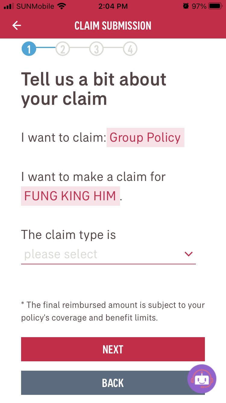
Need Statement
How might we enhance the claiming process of AIA connect app for group medical users to complete their medical claims faster and easier.
Overview
As a user of the AIA connect app, I would like to spend less time to submit my claims. I found that there are a few things in the claiming process which can be adjusted to make the process even easier. This is a case study to look into these things.
-
UX Research
Interface Design
-
Figma
Illustrator
After Effects
Survey
I am focusing on the claiming process of medical insurance and I asked users of group insurance policy questions on their experience of using the AIA connect app to submit their claims.
How do you feel when you use AIA connect to submit your insurance claim, can you tell me more on why do you feel so?
Are there any difficulties when you try to submit a claim using the app, can you explain more on why is it difficult?
Do you think making the submission process into 4 steps makes sense, if no, why is it so?
If there is one thing you would like to improve in this claiming process, what is it and why?
Is there a specific input field/step which can be simplified to make the process easier?
Users Feedback
“I go to the same doctor for physiotherapy. I will have to input the details all over again despite the fact that most of them are the same. It would be nice if I can just type the date and the amount.”
Rainnie
Pain point
Rainnie needs to go to visit physiotherapy regularly due to her back injury, she found that she needs to submit the same information again for each visit like the diagnosis and doctor’s referral letter. She would like to complete the claim as soon as possible and continue with her other tasks during work. She said it would help her a lot if she doesn’t need to submit those repetitive items all over again.
“It is a little difficult for me to find my diagnosis in the current format, because the list is so long.”
Airam
Pain point
Airam found the claiming process is easy to use overall but he struggles a bit when it comes to the diagnosis section because of the length of the list. It is hard to find his diagnosis in it because it is so long and there are many items in the list.
“It is hard for me to find my diagnosis when I don’t have any knowledge on the medical jargons.”
Shandy
Pain point
Shandy feels the same as Airam that the diagnosis list is too long and it is filled with medical jargons that she does not understand it makes it hard to pick the diagnosis of hers.
A journey map is used to understand the current state of the claiming process to identify which phase the user feel the most difficult.
Users feel that phase 3 is the most difficult part which is to fill in details.
Insight 1
Users are happy with the current flow overall
Insight 2
Users found it hard to input their diagnoses
Insight 3
It is hard to submit recurring claims
Prioritisation
After understanding users’ insights, there are several areas optimising the claiming process.
Diagnosis List
It is quite hard to find a diagnosis in the current list
There are a lot of diagnosis being shown in one option and most of them are medical jargons
2. Recurring Claims
Details need to be inputted again for recurring claims
There are only three input fields that are different most of the time, the date, the amount and the receipt.
3. Doctor Referral Letter
The doctor referral letter needs to be uploaded again for every claim.
The same document is needed to be uploaded again even when going to the same doctor.
4. Page Navigation
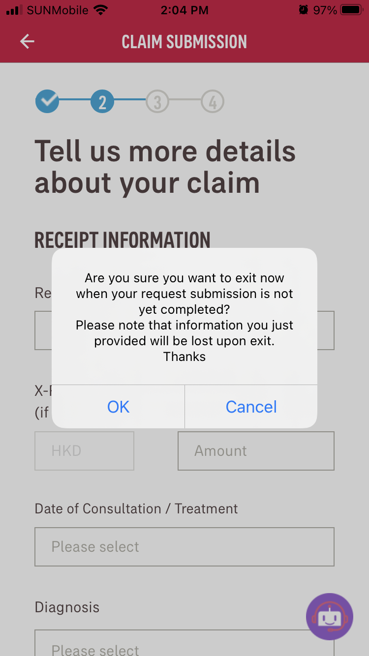
Top left back arrow key exits the claiming submission page
Users are used to the top left arrow key to be the back page key instead of an exit button.
I choose to prioritise Point 1 & 2 considering the impact vs effort matrix.
Both Point 1 & 2 has a high impact while point 2 has a relatively higher effort comparing to point 1. Point 3 has a low effort but the impact is low as well because if point 2 is tackled point 3 will be addressed naturally. While point 4’s impact is not too high but the effort needed is very small, so it is being addressed along the way.
Ideate
Different solutions are explored to tackle the pain points above
Exploring different options for the diagnosis list
1. Enhancing the drop down menu by dividing diagnoses into different categories and a search bar is added for easy navigation.
2. Pictorial representation of categories are made to help users to identify diagnoses.
3. Users can type in the diagnoses.
All 3 approaches are made to guide users to find their diagnosis easier to read less difficult jargons. It takes users more effort to find their own diagnosis when they are overwhelmed by the long list.
Making recurring claims easier
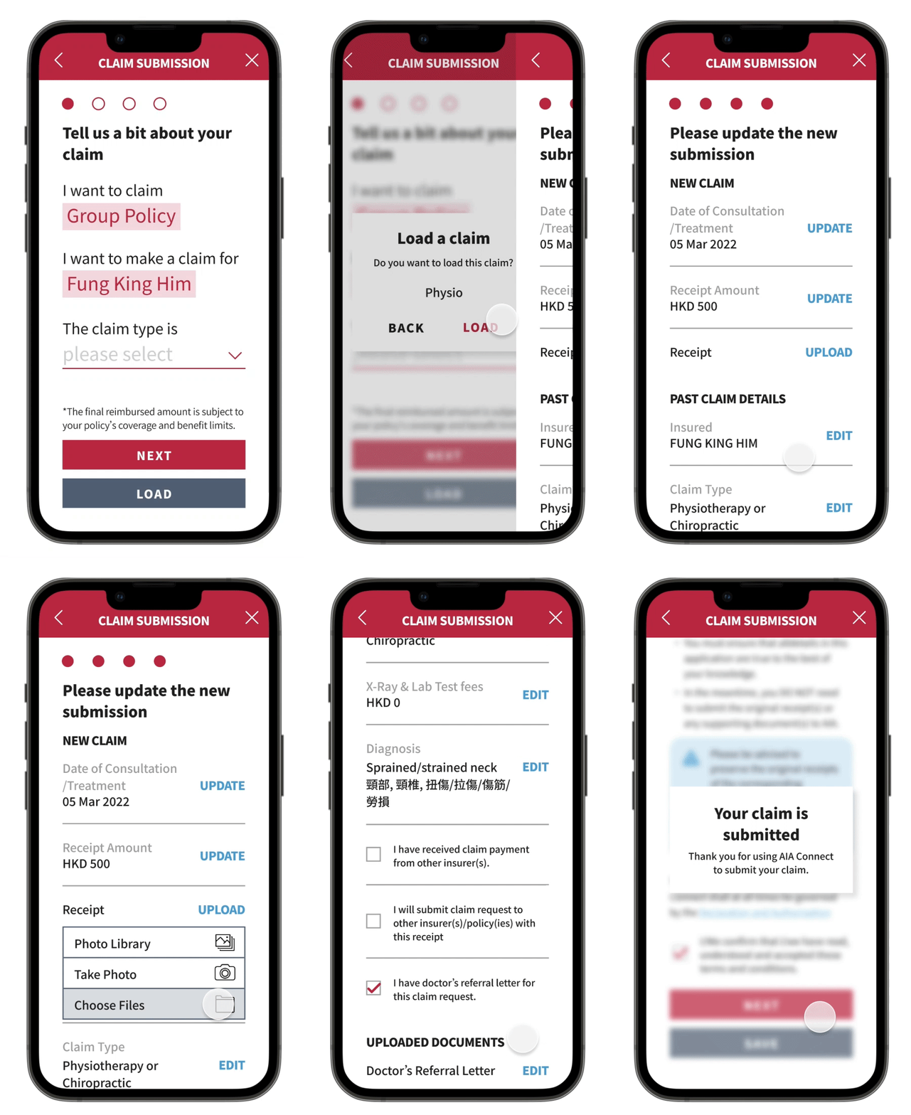
To make submitting recurring claims easier, a save and load function was added
Save Task Flow
Load Task Flow
A drop down menu type of method was drafted to make it take as less steps as possible when using.
A drop down menu linked between the save and load button is sketched to connect the two.
An easier navigation between pages
A fixed top bar which consist of back arrow key and close key
Back button at the bottom is erased to avoid confusion due to duplicates of the same function
Prototype
Based on the sketches above, prototypes are made to visualise the ideas. The diagnosis list is the first one I made to ask users for feedback.
1. Drop down menu with categories
2. Drop down menu with pictorial icons
3. Users type in their own diagnosis
After showing the prototypes to users, below are the numbers of the preferences of different users.
Overall findings
4 out of 5 users believe it is helpful to have a categorised drop down list because it helps them to find their diagnoses easier.
The same 4 of the users also think a search function is essential to find their own diagnoses, some even mentioning to highlight it.
Option 1
4 out of 5 users prefer to this option because it allows users to see all categories in one drop down, and the additional pictorial icon will not help much in identifying categories.
Option 2
4 out of 5 of the users think the pictorial icon will help them to identify a category easier.
Option 3
The remaining 1 user think that it is easier for them to type in what is written on the medical receipt because there are too many options to choose from.
Option 1 is picked
I have decided to adapt option 1 into my design for now because users are able to see all options within one drop down tab.
Option 2 is rather hard to use because the categories can only be switched one at a time.
To tackle the second pain point, recurring claims are difficult, the save/load function are made into a prototype.
Save Function
A list of saves is created to store past claim records
Load Function
Users can load their past claims from saved claims to save time for recurring claims, only the date of consultation, receipt amount and new receipt are needed to be updated to submit the new claim.
All users believe a save/load function will help them with recurring claims when this function was shown to them.
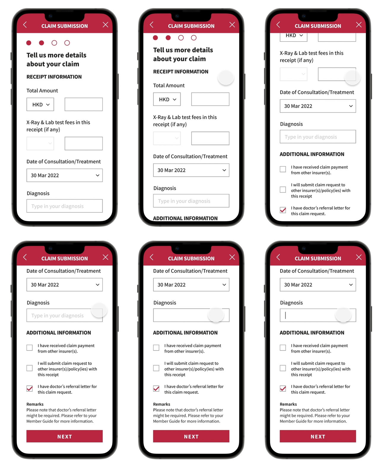
Addressing the third pain point, navigation between pages are difficult, a fixed top bar with back and close buttons are added while the back button at the button of the page is removed.
With this enhanced navigation it is more handy for users to navigate between pages without having to scroll down the page or mis-click the back button as close button.
Enhanced Navigation
Refining Prototype
I have also asked a senior designer for feedback to enhance the usability of my design
Diagnosis List
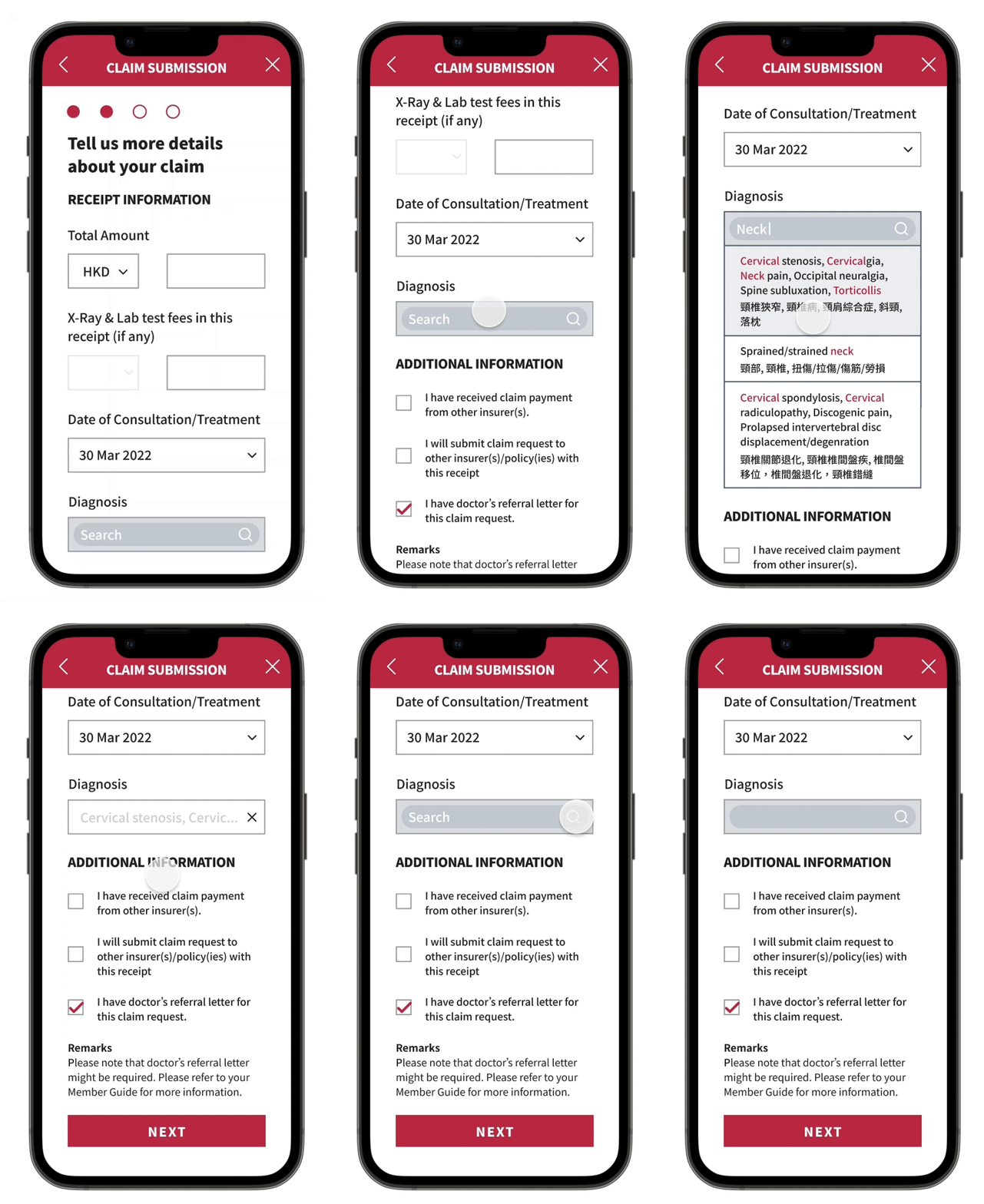
Finding a diagnosis with smart search
It is to avoid a drop down list with so many options, users are able to find relevant diagnosis with a keyword.
Save and Load
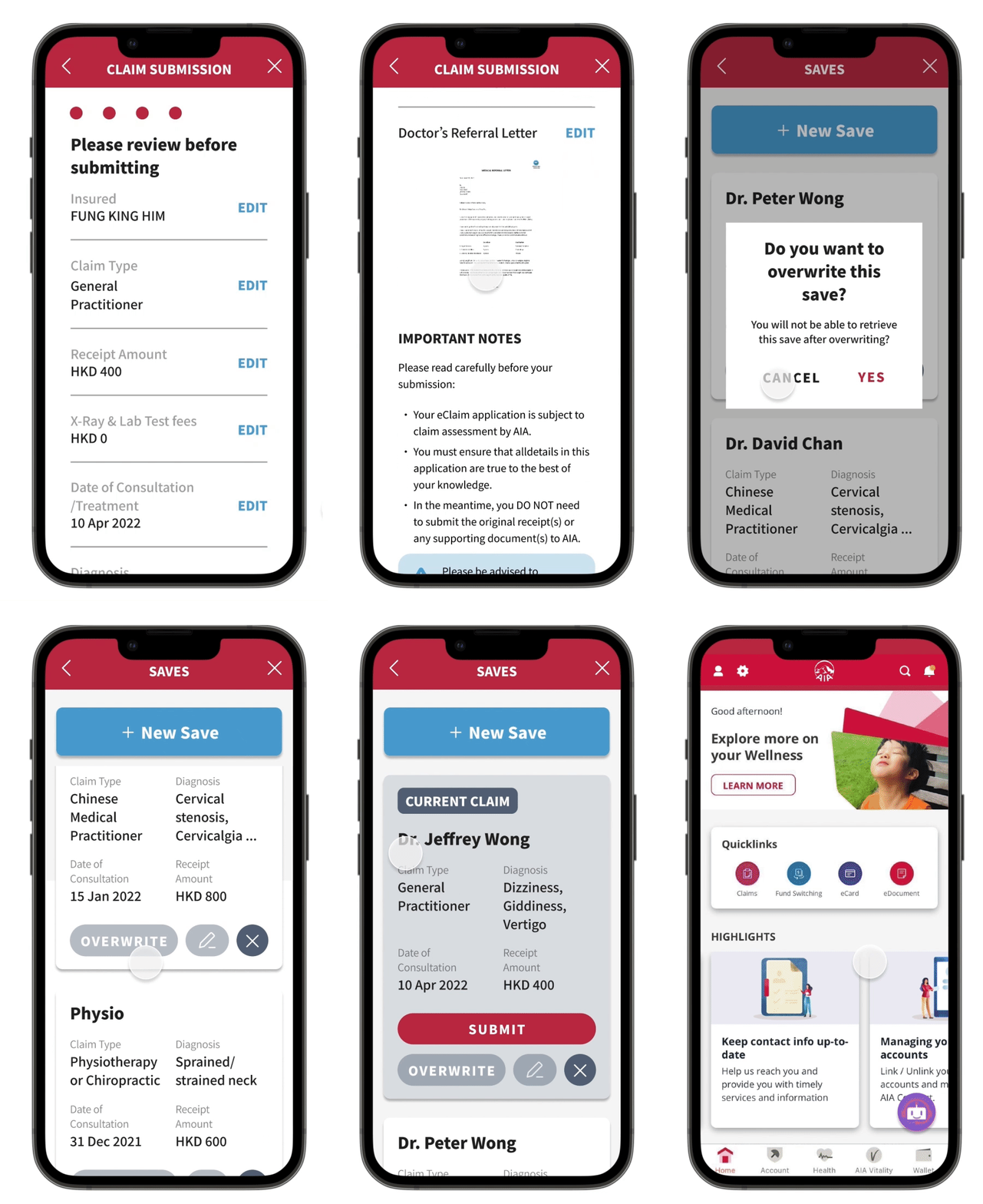
The journey map of the user is re-examined, I have decided to put the decision to load a saved claim or submit a new claim a step earlier at the homepage of the app because this is first thing users decide when they start the submitting process.
When users load a claim
A page which contains saved claims are made to connect both load and save function. The page is in the form of tickets to show the saved data to show essential details for users to identify their previous claims.
When users save a claim
Users can save a claim in the saves page as a new save or overwrite a current save. The saves page connects both the load and save function in the form of tickets and can be accessed separately.
The Product
Reflection
Users provide a solution sometimes
When I was interviewing the users, some of them provide a solution for me when I am asking their experience when using the product. I believe they are useful feedback but more questions are needed to distill an objective answer to describe the rationale behind their user experience to identify a pain point.
2. The Importance of Visualisation
It is essential to show a tangible prototype and ask for feedback instead of using words to describe an idea when asking for feedback. Users can quickly identify an option to go to when I showed them prototypes to choose from. However, when we tried to further elaborate on an option, the idea was lost in words. It validates the importance of a prototype.


